

Monday, 19 December 2016
Thursday, 10 November 2016

Tuesday, 27 September 2016
Showcase of foil stamping
We can get so used to the notion that foil is just to pick out a few highlights that we can forget it can be the hero as well, as displayed in a really nice selection of foil stamping in use over at Spoon Graphics here


Friday, 23 September 2016
Text columns (and rows) in Illustrator
Illustrator is traditionally seen as a drawing package and its easy to overlook some of its text capabilities. For instance did you know that you can break a text frame into columns in Illustrator?
Go to Type > Area Type Options and you'll get the following dialogue box where you can define the number of columns, gutter width and an overall text inset for the text frame. In addition there's a checkbox titled "fixed". If you resize the frame with this unchecked Illustrator will increase or decrease the width of the columns so there is always just the number you specified. If you check "fixed" Illustrator will keep the columns the correct width and simply add extra ones.
Plus, everything you can do with columns you can also do with rows, making tables much easier to create in Illustrator.

Wednesday, 21 September 2016
Tuesday, 13 September 2016
Keep it in the text chain
If you're working on a long document then whenever possible, even if it's a little extra work to do in the initial set up stage, try to keep things anchored in the text chain. If you just leave things loose in place and then some new paragraphs are inserted in the front, ALL those loose elements will have to be repositioned manually. Not only is this very inefficient time wise, but its also very frustrating for the person making the amends and having to reposition everything when they know if YOU'D just set it up right it would all have happened automatically.
There are multiple ways to do this of course, depending on what you're trying to achieve. You can anchor pictures and items like lines or graphics in the text, you can use tables creatively (even just a single cell if necessary), you can paste text boxes into the text chain and you can even anchor objects OUTSIDE the text chain in the margins within the text.
For example in the layout below the page on the left has both the photo and the sideways heading in the margin anchored within the text chain (hence the small anchor icons) and the heading with the pink background is done with a paragraph rule. As a result everything will move with the text. Whereas the page on the right has the photos and sideways headings placed manually whilst the pink heading is achieved with a pink line placed behind the text box.

Now see what happens when we insert even just a line of text in the opening paragraph…

On the left page all the elements have just moved with the text. Whereas on the right all the manually placed items will now have to be repositioned, and the same goes for every subsequent page.
So keep it in the chain wherever possible and save yourself and everyone else a lot of heartache later.
Less is more
Nine times out of ten someone else is going to have to use your artwork - whether to make amends, or create a new piece of artwork - so when you create your artwork try to keep it simple, especially if you are a freelancer.
There's nothing worse than opening up someone else's artwork to discover that, although it looks okay in preview mode and even prints fine, its a dogs dinner, e.g. there's a boxed out panel made from a transparent text box, laid over a different sized, coloured picture box all grouped together with two lines for borders and just left loose in its position on the page.
All of which could have been done as a table which, as part of the text chain, will flow with any text amends. The table cell will automatically expand if more text is inserted into it (as would an automatically sizing text frame).
If you can do something with just one element why would you use five, just because that's how you muddled your way through the first time you sat in front of InDesign? If you can create a new piece in such a way that no extra work is involved to change it then do it THAT WAY.
Tuesday, 6 September 2016
Alternatives to Gotham
I love Gotham, its just a beautifully designed typeface. But, like most people who encounter it, I'm tempted to overuse it. Back in my college days I noticed how overused Optima was across Dublin and once I started seeing it EVERYWHERE I took a personal dislike to it. No fault of Optima's I hasten to add. Its a perfectly serviceable face. But I don't want the same to happen with Gotham, so its lucky Creativebloq have given us a list of some practical alternatives here…
So next time I reach for the Gotham I'll take a look at these first!
So next time I reach for the Gotham I'll take a look at these first!
Friday, 2 September 2016
Online barcode generator
If you've been supplied a barcode number for a packaging job by a client rather than the barcode itself you can easily generate one online where you will find numerous site to do this for free. The one I use is from Terry Burton and can be found here…
It's a very no frills page but it gets the job done and delivers the results as EPS, PNG or JPEG. NB you really need to know what type of barcode you want (EAN-13, UPC-A, ISBN, QR Code etc.) before you proceed.
It's a very no frills page but it gets the job done and delivers the results as EPS, PNG or JPEG. NB you really need to know what type of barcode you want (EAN-13, UPC-A, ISBN, QR Code etc.) before you proceed.
Thursday, 1 September 2016
Simulate a master page in Illustrator
Say you have a lot of files to produce that are basically the same. Lets say it's a series of blister packs that are all pretty much the same - the logo, the product name, background image, price, some small print, manufacturer details, barcode etc. and most of these will stay the same across the whole range with just things like the product name, price and barcode changing from pack to pack.
A perfect candidate for InDesign and a master page yes? But unfortunately you have to do this in Illustrator, either because the client insists, because you're not comfortable in InDesign or perhaps you have inherited old artwork in Illustrator format that just needs updating.
Well here's the trick. Did you know that you can place an Illustrator file into an Illustrator file? So what you do is set up your file to the correct dimensions but with only the elements that are common to every pack - the MASTER elements, i.e. The background, the logo, background image, small print etc. and save it as a plain Illustrator file. Lets call this the master illustrator file.
Next you set up your Artwork file to the same dimensions and PLACE the master illustrator file into it, on its own layer. Now you can add the variable elements like the product name and price on a layer above till everything looks just right. Now you have one pack all set up you just need to create additional artboards for all the other packs in the range and copy and PASTE IN PLACE the elements you have created onto each artboard and rename each product, price etc. across the range.
Here's the beauty of this though. If subsequently the manufacturers address, the small print or anything else on the master layer needs to change, you just open your original master illustrator file, make the changes and hit save. Then back in your artwork you simply update the links and voila. those changes have been made to every pack.
Wednesday, 31 August 2016
Keep text sharp in Photoshop
Photoshop is a bitmap based application, i.e. if you look very closely you will see the pixels/jaggies. For an photo that isn't always the limitation you might think. Because they aren't regular, with straight edges etc. you can often get away with blowing an image up more than recommended, especially if it is on something to be seen from a distance rather than held in the hand, like a pull up banner or a mural.
I discovered just how much you can get away with when I once designed an A6 postcard for a client. They were so happy they asked the printer to also produce A1 posters from the same file! I could have easily provided A1 artwork but the first I heard of it was when I saw the poster on a wall. Initially horrified I then realised it looked alright from across the street. It even looked okay from 10 feet away. It was only when I got closer than you really would for a poster that I could make out how ropey it actually was.
The thing that really let it down was text that was incorporated into the image and had been set in Photoshop. If, instead of saving the final image as a TIFF copy (or even the native PSD format) for use in InDesign, I had saved the image as a Photoshop PDF then all the text I had set would have stayed as sharp, vector elements… and even up close the text on that poster would have still looked sharp.
Read more here…
Tuesday, 23 August 2016

Friday, 29 July 2016

Thursday, 28 July 2016

Wednesday, 20 July 2016

Tuesday, 19 July 2016

Sunday, 10 July 2016
A guide to printing techniques
The folks over at Designconstruct have compiled an excellent guide to printing techniques which you can find here …


Wednesday, 6 July 2016
Keep your Photoshop files compact
Creative market have a quick guide to keeping your PSDs small before uploading and selling them, but we can all learn something about how we manage our files from it. Check it out here.


Friday, 1 July 2016

Thursday, 30 June 2016
The new Netflix logo
I'm a fan of Netflix's new logo, which is a nice evolution that will work well whether as an icon on a phone or up on a billboard. There's a good discussion of it over on fastcodesign
Knowledge of software does not a designer make
I have noticed that lately people seem to believe that knowing how to use Adobe's software equates to a design qualification when nothing could be further from the truth. You can create powerful design with a pencil and paper and all the software in the world won't make a bad design a good one.
Over the years I have increasingly seen people enter the workplace, or worse set up as design studios, without the most basic knowledge of what constitutes good design - balance, negative space, typography, colour theory etc. People cobbling together bad artwork and dodgy layouts who think because they can create a table in InDesign they can tackle anything. I know not everyone can afford higher education but actually most of what I learned I learned on the job, based on a solid foundation learned in college. A foundation that can be learned in other ways too. I'm a big believer in 'read a book' and there are plenty design videos and tutorials online or online courses that are very affordable.
As with most things a bit of talent, coupled with a bit of guidance and a willingness to learn can go a long way towards improving anyone's work. But reading a software manual from cover to cover will never teach you how to be a designer.
Friday, 17 June 2016
Edit a PDF in illustrator even without the fonts required
Oftentimes, especially in the printing industry, a client will come to you with an old PDF that they want changed. They don't have the original design files for one reason or another but they need a change made to the artwork for a reprint, maybe changing the offer or some such. There's no budget so resetting the whole thing is out of the question, but the background is complicated so you cant just slap a new text box over the top. What to do?
Well one thing you can do is open the PDF in Illustrator and make the changes. Open it up, load the relevant fonts if any are missing, edit the text and then hit SAVE – NB not SAVE AS. Hitting save will preserve all the attributes of the original PDF like bleed, trims etc.
One caveat. If the last time you used illustrator you created a PDF with say bleed and trim marks, then when you hit save Illustrator may add an additional set of those trims and bleeds to your newly edited PDF. So its not a bad idea before you edit a PDF in this way you quickly create a blank illustrator document and save it as a normal, Illustrator PDF.
But what if you open up the PDF and you find out you're missing a vital font. Some unusual, grungy font you'll never be able to identify has opened up in the default font, which is completely wrong. Well in this case you can open a new document and PLACE the PDF into it. With the PDF still selected go to OBJECT > FLATTEN TRANSPARENCY. You will see a dialog box and here you must make sure you have checked "Convert All Text to Outlines". This will produce a result similar to above but with all the text converted to outlines (using the font data embedded in the PDF). From this you can keep the outlined versions of that unusual, grungy missing font.

Between the two techniques you can usually get a result. In fact if you open up the PDF you want to edit in Illustrator you can also actually place a copy of itself off to the side, lined up horizontally with the artwork and use flatten transparency to create an outlined version. Then delete the elements which aren't working on the artboard and slide across their outlined counterparts. Then hit save!
Friday, 27 May 2016
Mail merging in InDesign - Part 1
You really shouldn't be afraid of doing a mail merge. Although it LOOKS complicated its actually very simple. Once you've done one or two you'll wonder why you were ever intimidated by this easy to use but powerful feature.
At its most basic a mail merge is a way of laying out something and then having it automatically generate many copies of the same thing but with certain areas changed or personalised by using a file from a spreadsheet.
The obvious example that everyone will have at least heard about is using a database of customers to personalise a letter. So lets have a look at that first. Lets say I need to design a promotional letter, or mail shot, to be sent out to all of a clients customer's and both the address and the "Dear Sir" part, or saultation, will be personalised to each customer. The address will need to be seen through the window area of this envelope'

So here is the design laid out. It has the company logo, just like their letterhead, a promotional offer and the address has been set to fall within the window area of the letter.

Next we need to look at our database. The HEADINGS at the top of the database are the key. When you import your data into your design it is the headings which you will be placing and styling. Then when you are happy with everything the data merge will replace the headings with the actual information in the spreadsheet. The headings run across the top of the file in Row 1 - here they begin first name, last name, company name, address etc.

N.B. You will almost certainly be supplied the spreadsheet as an Xcel file or something similar. In order to use this you must open the file in your spreadsheet application and save a copy as a .csv (comma separated values) file. This is the format which InDesign uses.
Once you have done that return to InDesign and go ahead and open the data Merge pane (Window > Utilities > Data Merge)

and from there browse to your newly saved .csv file. You will see that the Data Merge pane is now populated with the headings from the .csv file.

Now, in your letter layout, select the piece of text for the first name, in this case "Joe" and while it is still selected double click the corresponding heading in the Data Merge pane, i.e. "first_name". You will see that "Joe" has been replaced with the heading "first_name" with a couple of odd brackets around it to show it is now linked to the data merge.

When you do your merge InDesign will replace <<first_name>>, one by one, letter by letter, with the list of names in the "first_name" column of the .csv file. But first go ahead and fill the rest of the fields.

Notice that the headings are slightly different to how I initially imagined them. For example, there is now a company name that I hadn't anticipated but thats ok. Also notice that the style of the text has taken on the size, leading, colour and stye I used to lay out the letter. Had I designed the address to be an orange, undelined, marker script then the data would be the same… and I can still change it now if I wish. Also notice that I have manually inserted a comma at the end of each line and a full stop to finish the address as these aren't part of the data.
Finally, using the same process you can also go ahead and personalise the "Dear Mr. Bloggs" section.

Now you are ready to create your merge. In the little fly out menu on the Data Merge pane you will see several options. Preview will let you preview how your merge looks. Create Merged Document will create an NEW document with a letter per page, each filled with the correct data from the .csv file.
In general you can leave things set as they are, but on the third tab "Options" there is an option to "Remove blank lines for empty fields" this will stop Indesign creating a blank line if a field in the .cv file is empty, e.g. if there is no company name then the gap between the lines will be closed up.
And here is the final result.

NB You should save BOTH your original file and the new merged one in case you need to repeat the merge again.
Next time I will show you how to use mail merge more creatively and even merge images!
If all else fails fudge your small caps
One thing that often bothers me is seeing small caps that are clearly not true small caps but 'faked' by the software scaling down the capitals.
True small caps are a separate weight of the font with the lower case letters as small versions of the capital letters, and are designed to look well set against the true capitals e.g. the vertical strokes are a similar thickness.

When you use your software to 'fake' small caps by setting upper and lower case text and then selecting the 'small caps' option you can get a pretty ugly result depending on which font you use.

See how different the letters look side by side compared to the example above?
Unfortunately not all fonts include a small caps weight, so what to do then? Well in some cases the result won't look too bad and a little tweaking of the advanced type preferences (where small caps are typically set to something like 70% actual size) either up or down in size can help.
Alternatively you could 'fudge' it by setting the small caps in a slightly heavier weight of the font than the caps themselves. In this example the caps are set in Quadraat Regular but the small caps are set in Quadraat Bold.
Its not perfect but it definitely easier on the eye than the software's attempt above.

Wednesday, 25 May 2016
Star Wars in a single image
The whole of Star Wars Episode IV told in one long image. Whether you like Star Wars or not this is an incredible feat of infographic visualisation.


Monday, 23 May 2016
Star Trek spot the difference
The new “Star Trek Beyond” teaser poster pays a nice homage to the original movie “Star Trek the Motion Picture”


Thursday, 19 May 2016
Why do some fonts get used again and again
If you're a typeface nerd, like me, you might find this article from 'a list apart' worth a read.
Wednesday, 18 May 2016

Monday, 16 May 2016
Avoid page number problems when making amends to a long document
Its happened to us all. We get the changes back on a long document as a series of comments from the client and as we work our way through the changes and pieces get rewritten or extra copy gets inserted we soon find ourselves in the situation where the client has said something like “P38, 2nd para, change 'this' to 'that'”. But try as you might you can't find a 'this' on the 2nd paragraph of page 38 … because the changes made earlier mean the copy has since flowed on another page or two. And with a hundred more pages its only going to get worse.
Better to start with the last correction and work your way towards the front, that way everything makes sense as you come to it. Yes your amends may well cause the text on subsequent pages to reflow, but since you've already made those changes it won't cause any confusion.
Better to start with the last correction and work your way towards the front, that way everything makes sense as you come to it. Yes your amends may well cause the text on subsequent pages to reflow, but since you've already made those changes it won't cause any confusion.
Sunday, 15 May 2016
Find a stock image that hasn't been used to death
Next time you're searching a stock image library for say “female business receptionist” don't just start your search on page one and keep going till you find the right image. Consider starting on page ten or fifty. That way you're already looking at results that most people never made it to, which increases the chances of you finding a unique image. Or consider filtering your search by the number of downloads. Either way you decrease the chance of you using a popular image that's been seen on other projects, which is a more common problem than you might think, even in little old Ireland. Trust me … I speak from experience!
Monday, 9 May 2016
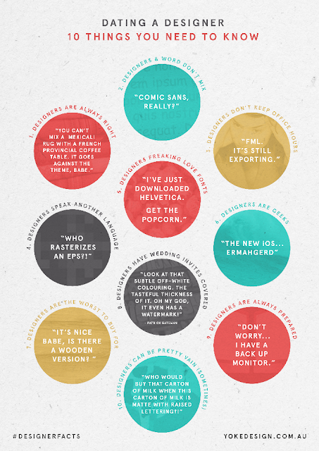
Funny 'cos its true?
The folks over at yokedesign have a fun, kinda accurate article on what its like to date a designer here

Sunday, 8 May 2016

Thursday, 5 May 2016
15 examples of perfect handwriting
My own handwriting sometimes looks as though a drunken spider escaped a bottle of ink and crawled across the page, so these gave me some serious penmanship envy


Wednesday, 4 May 2016
Quick colour combinations
Need a selection of colours that work well together? A pallette thats bang on trend? Or do you just find picking colours a bit difficult? Then head over to colourlovers.com for some quick assistance.
Tuesday, 3 May 2016
Picking the right type of chart for the job
Visualising data is becoming ever more important and common. And using the right chart for the job is an important decision. Luckily the people over at datalabs.com have gathered together a handy guide to the most common types of chart for visualisation together with a handy flowchart to help you pick the right one here

Monday, 2 May 2016
Set the european estimated 'e' symbol in a font
We're all pretty familiar with the little 'e' symbol on products that lets us know that the weight or volume is estimated.

As a considerable amount of packaging is done in Adobe Illustrator, over the years we've all become used to dragging a little vector version of this symbol to where its needed and at the size required (no less than 3mm). But this can be problematic, especially when text changes or moves to a new position as the symbol has to be moved too.
Far better to simply set it as part of the text, which is a simple affair that has passed a lot of people by. As fonts have been updated to include new characters many now include the estimated 'e'. You can see a list here.
Be careful though, many of these are designed to fit with the font family they are part of and as such aren't technically correct. My advice is to stick with 'Myriad Pro' which gives perfect results.
Now you can move text around, reset it or change colour and the estimated symbol will follow along!
Saturday, 30 April 2016
Difficulty matching fonts?
Are you having difficulty matching fonts together? The people over at DesignMantic have come up with this infographic to help you.

Friday, 29 April 2016
The decline and fall of the ligature
Another interesting article from the folks at I Love Typography http://ilovetypography.com/2007/09/09/decline-and-fall-of-the-ligature/

Thursday, 28 April 2016
Scratchboard drawing of Benjamin Franklin by Michael Halbert
I used to love doing scraperboards when I was younger, but this is quite something to watch …
Tuesday, 26 April 2016
Rebranding needs to be carefully considered
The guys over at Canny creative have an interesting article on ten rebranding disasters that makes for interesting reading http://www.canny-creative.com/2013/10/10-rebranding-failures-how-much-they-cost/
Monday, 25 April 2016
Have you ever wondered why superheroes wear their underwear on the outside?
Turns out it was to do with the limits of the printing process used to produce early comics. You can read all about it here http://indiatoday.intoday.in/story/ever-wondered-why-superheroes-wear-underwears-on-the-outside/1/478836.html

Friday, 22 April 2016
Identifying a font
Have you ever seen a font somewhere you like but don't recognise? Or been handed a printed sample and asked to match it for a new piece of work … but you just can't quite place the font used? Well that's where 'What the font?' comes in. Take a scan, a screen grab or some sort of half decent image and follow the instructions on screen and nine times out of ten WTF will identify it for you. There's also an active forum where you can post your image and ask for help.
On the off chance WTF can't help you can always head over to 'Identifont' where you will be asked a series of questions about the font and then offered some suggestions as to what it might be.
So there you go. Never be stuck trying to name a font again!
On the off chance WTF can't help you can always head over to 'Identifont' where you will be asked a series of questions about the font and then offered some suggestions as to what it might be.
So there you go. Never be stuck trying to name a font again!
Thursday, 21 April 2016
'Gotham' designers bitter $20 million break-up
Anyone who likes type cannot have escaped the rise and rise of Gotham, a sans serif typeface that whilst clean and elegant was also highly legible and came in numerous weights. No wonder that for a while it seemed to be everywhere.
Now it seems the designers are in court with $20 million at stake. Read the fascinating tale here http://www.bloomberg.com/news/articles/2014-05-15/font-war-inside-the-design-worlds-20-million-divorce
Now it seems the designers are in court with $20 million at stake. Read the fascinating tale here http://www.bloomberg.com/news/articles/2014-05-15/font-war-inside-the-design-worlds-20-million-divorce
Wednesday, 20 April 2016

Irish monks invented the spaces between words
We designers love our typography and laying out text so it is clear and legible. But did you know that it was 7th century Irish monks invented the spaces between words and exported it to the rest of Europe? Before that the words ran together continuously in what was known as "Scriptio continua".
Read more here … https://en.wikipedia.org/wiki/Word_divider and here https://en.wikipedia.org/wiki/Scriptio_continua
Read more here … https://en.wikipedia.org/wiki/Word_divider and here https://en.wikipedia.org/wiki/Scriptio_continua
Tuesday, 19 April 2016
Refining Aston Villa’s club badge
There's a lovely post over on Logo Design Love showing the redesign of the Aston Villa Lion by traditional engraver and artist Christopher Wormwell showing that sometimes, to get the right result, you have to eschew the mouse. Check it out here … http://www.logodesignlove.com/aston-villa-club-badge


Monday, 18 April 2016
Lorem Ipsum is "pain itself"
In publishing and graphic design "Lorem Ipsum" is filler text commonly used to replace meaningful content with unreadable text thereby allowing viewers to focus on graphic aspects such as font, typography, and page layout without being distracted by the content.
Contrary to popular belief, Lorem Ipsum is not simply random text. It has roots in a piece of classical Latin literature from 45 BC, making it over 2,000 years old. The term "lorem ipsum" is derived from the latin "dolorem ipsum" which translates as "pain itself" … which anyone who has repeatedly had clients ask why they can't read the text in the visual might find apt.
You can generate as many paragraphs of this dummy text as you like at this site: Lorem Ipsum
Or, if you are using InDesign you can simply select a text box with the type tool, go to the TYPE menu, scroll down and select "Fill with placeholder text" and your box will fill with latin placeholder text.
Sunday, 17 April 2016
An excellent 10 minute tutorial on cut-outs in Photoshop
The guys over at Spoon Graphics have put together an excellent tutorial on how to cut out tricky subjects in Photoshop. Combine this with careful use of layers and you can make one image serve multiple purposes.
Check it out here … How To Cut Anything Out in Photoshop
Check it out here … How To Cut Anything Out in Photoshop
Wednesday, 6 January 2016
Welcome
Hello and welcome to my blog slash website where not only can I showcase my work but I also hope to share interesting design and art related posts from around the web and some of the top tips I have learned in over 20 years in the business. Enjoy!
Subscribe to:
Comments (Atom)