Friday, 27 May 2016

Mail merging in InDesign - Part 1

You really shouldn't be afraid of doing a mail merge. Although it LOOKS complicated its actually very simple. Once you've done one or two you'll wonder why you were ever intimidated by this easy to use but powerful feature.

At its most basic a mail merge is a way of laying out something and then having it automatically generate many copies of the same thing but with certain areas changed or personalised by using a file from a spreadsheet.

The obvious example that everyone will have at least heard about is using a database of customers to personalise a letter. So lets have a look at that first. Lets say I need to design a promotional letter, or mail shot, to be sent out to all of a clients customer's and both the address and the "Dear Sir" part, or saultation, will be personalised to each customer. The address will need to be seen through the window area of this envelope'
So here is the design laid out. It has the company logo, just like their letterhead, a promotional offer and the address has been set to fall within the window area of the letter.

Next we need to look at our database. The HEADINGS at the top of the database are the key. When you import your data into your design it is the headings which you will be placing and styling. Then when you are happy with everything the data merge will replace the headings with the actual information in the spreadsheet. The headings run across the top of the file in Row 1 - here they begin first name, last name, company name, address etc.


N.B. You will almost certainly be supplied the spreadsheet as an Xcel file or something similar. In order to use this you must open the file in your spreadsheet application and save a copy as a .csv (comma separated values) file. This is the format which InDesign uses.

Once you have done that return to InDesign and go ahead and open the data Merge pane (Window > Utilities > Data Merge) 


and from there browse to your newly saved .csv file. You will see that the Data Merge pane is now populated with the headings from the .csv file.


Now, in your letter layout, select the piece of text for the first name, in this case "Joe" and while it is still selected double click the corresponding heading in the Data Merge pane, i.e. "first_name". You will see that "Joe" has been replaced with the heading "first_name" with a couple of odd brackets around it to show it is now linked to the data merge.


When you do your merge InDesign will replace <<first_name>>, one by one, letter by letter, with the list of names in the "first_name" column of the .csv file. But first go ahead and fill the rest of the fields.


Notice that the headings are slightly different to how I initially imagined them. For example, there is now a company name that I hadn't anticipated but thats ok. Also notice that the style of the text has taken on the size, leading, colour and stye I used to lay out the letter. Had I designed the address to be an orange, undelined, marker script then the data would be the same… and I can still change it now if I wish. Also notice that I have manually inserted a comma at the end of each line and a full stop to finish the address as these aren't part of the data. 

Finally, using the same process you can also go ahead and personalise the "Dear Mr. Bloggs" section.


Now you are ready to create your merge. In the little fly out menu on the Data Merge pane you will see  several options. Preview will let you preview how your merge looks. Create Merged Document will create an NEW document with a letter per page, each filled with the correct data from the .csv file. 

In general you can leave things set as they are, but on the third tab "Options" there is an option to "Remove blank lines for empty fields" this will stop Indesign creating a blank line if a field in the .cv file is empty, e.g. if there is no company name then the gap between the lines will be closed up.
And here is the final result.


NB You should save BOTH your original file and the new merged one in case you need to repeat the merge again.

Next time I will show you how to use mail merge more creatively and even merge images!

If all else fails fudge your small caps

One thing that often bothers me is seeing small caps that are clearly not true small caps but 'faked' by the software scaling down the capitals.

True small caps are a separate weight of the font with the lower case letters as small versions of the capital letters, and are designed to look well set against the true capitals e.g. the vertical strokes are a similar thickness.


When you use your software to 'fake' small caps by setting upper and lower case text and then selecting the 'small caps' option you can get a pretty ugly result depending on which font you use.


See how different the letters look side by side compared to the example above?

Unfortunately not all fonts include a small caps weight, so what to do then? Well in some cases the result won't look too bad and a little tweaking of the advanced type preferences (where small caps are typically set to something like 70% actual size) either up or down in size can help.

Alternatively you could 'fudge' it by setting the small caps in a slightly heavier weight of the font than the caps themselves. In this example the caps are set in Quadraat Regular but the small caps are set in Quadraat Bold.

Its not perfect but it definitely easier on the eye than the software's attempt above.


Wednesday, 25 May 2016

Star Wars in a single image

The whole of Star Wars Episode IV told in one long image. Whether you like Star Wars or not this is an incredible feat of infographic visualisation.

Monday, 23 May 2016

Star Trek spot the difference

The new “Star Trek Beyond” teaser poster pays a nice homage to the original movie “Star Trek the Motion Picture”


Thursday, 19 May 2016

Why do some fonts get used again and again

If you're a typeface nerd, like me, you might find this article from 'a list apart' worth a read.

Wednesday, 18 May 2016

Sainsbury's seem to think art is worthless

But they got quite the response! Read more here


Monday, 16 May 2016

Avoid page number problems when making amends to a long document

Its happened to us all. We get the changes back on a long document as a series of comments from the client and as we work our way through the changes and pieces get rewritten or extra copy gets inserted we soon find ourselves in the situation where the client has said something like “P38, 2nd para, change 'this' to 'that'”. But try as you might you can't find a 'this' on the 2nd paragraph of page 38 … because the changes made earlier mean the copy has since flowed on another page or two. And with a hundred more pages its only going to get worse.

Better to start with the last correction and work your way towards the front, that way everything makes sense as you come to it. Yes your amends may well cause the text on subsequent pages to reflow, but since you've already made those changes it won't cause any confusion.

Sunday, 15 May 2016

Find a stock image that hasn't been used to death

Next time you're searching a stock image library for say “female business receptionist” don't just start your search on page one and keep going till you find the right image. Consider starting on page ten or fifty. That way you're already looking at results that most people never made it to, which increases the chances of you finding a unique image. Or consider filtering your search by the number of downloads. Either way you decrease the chance of you using a popular image that's been seen on other projects, which is a more common problem than you might think, even in little old Ireland. Trust me … I speak from experience!

Monday, 9 May 2016

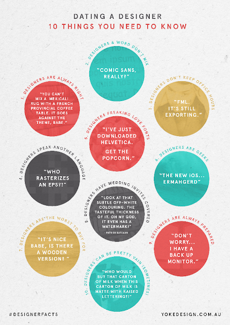
Funny 'cos its true?

The folks over at yokedesign have a fun, kinda accurate article on what its like to date a designer here


Sunday, 8 May 2016

Thursday, 5 May 2016

15 examples of perfect handwriting

My own handwriting sometimes looks as though a drunken spider escaped a bottle of ink and crawled across the page, so these gave me some serious penmanship envy


Wednesday, 4 May 2016

Quick colour combinations

Need a selection of colours that work well together? A pallette thats bang on trend? Or do you just find picking colours a bit difficult? Then head over to colourlovers.com for some quick assistance.

Tuesday, 3 May 2016

Picking the right type of chart for the job

Visualising data is becoming ever more important and common. And using the right chart for the job is an important decision. Luckily the people over at datalabs.com have gathered together a handy guide to the most common types of chart for visualisation together with a handy flowchart to help you pick the right one here


Monday, 2 May 2016

Set the european estimated 'e' symbol in a font

We're all pretty familiar with the little 'e' symbol on products that lets us know that the weight or volume is  estimated.

As a considerable amount of packaging is done in Adobe Illustrator, over the years we've all become used to dragging a little vector version of this symbol to where its needed and at the size required (no less than 3mm). But this can be problematic, especially when text changes or moves to a new position as the symbol has to be moved too.

Far better to simply set it as part of the text, which is a simple affair that has passed a lot of people by. As fonts have been updated to include new characters many now include the estimated 'e'. You can see a list here.

Be careful though, many of these are designed to fit with the font family they are part of and as such aren't technically correct. My advice is to stick with 'Myriad Pro' which gives perfect results. 

Now you can move text around, reset it or change colour and the estimated symbol will follow along!